Style Guide presentation for The State Hermitage museum rebranding
This presentation was prepared for a branding course. As part of the course, a new corporate identity and branding were developed for the Hermitage Museum in Saint Petersburg. The result was a new brand book and corporate style, compiled into a final presentation for use by various divisions of the brand as a style guide for their future visual representation
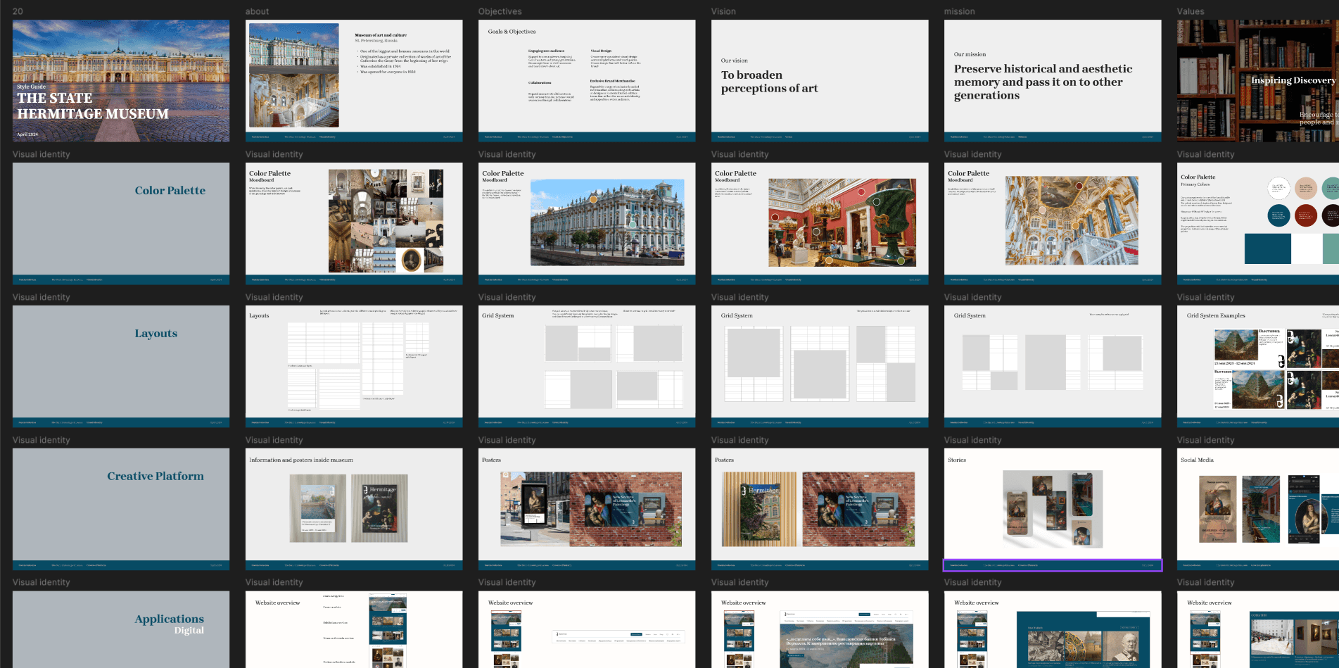
The primary goal was to design a presentation that not only effectively reflected the content but also maintained a style that aligned with the subject matter. It needed to be highly readable, straightforward in structure, and captivating in its visual appeal to keep the audience engaged while delivering the intended message clearly.
DESIGN SOLUTIONS
FONT
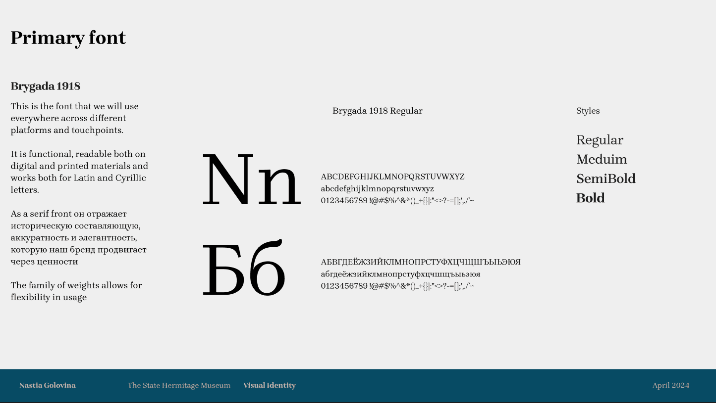
The font for the presentation was selected based on the theme of the presentation and the font chosen for the rebranding. Since the brand font is Brygada 1918, the same font was used for the presentation design to maintatin the same style and consistency
COLORS
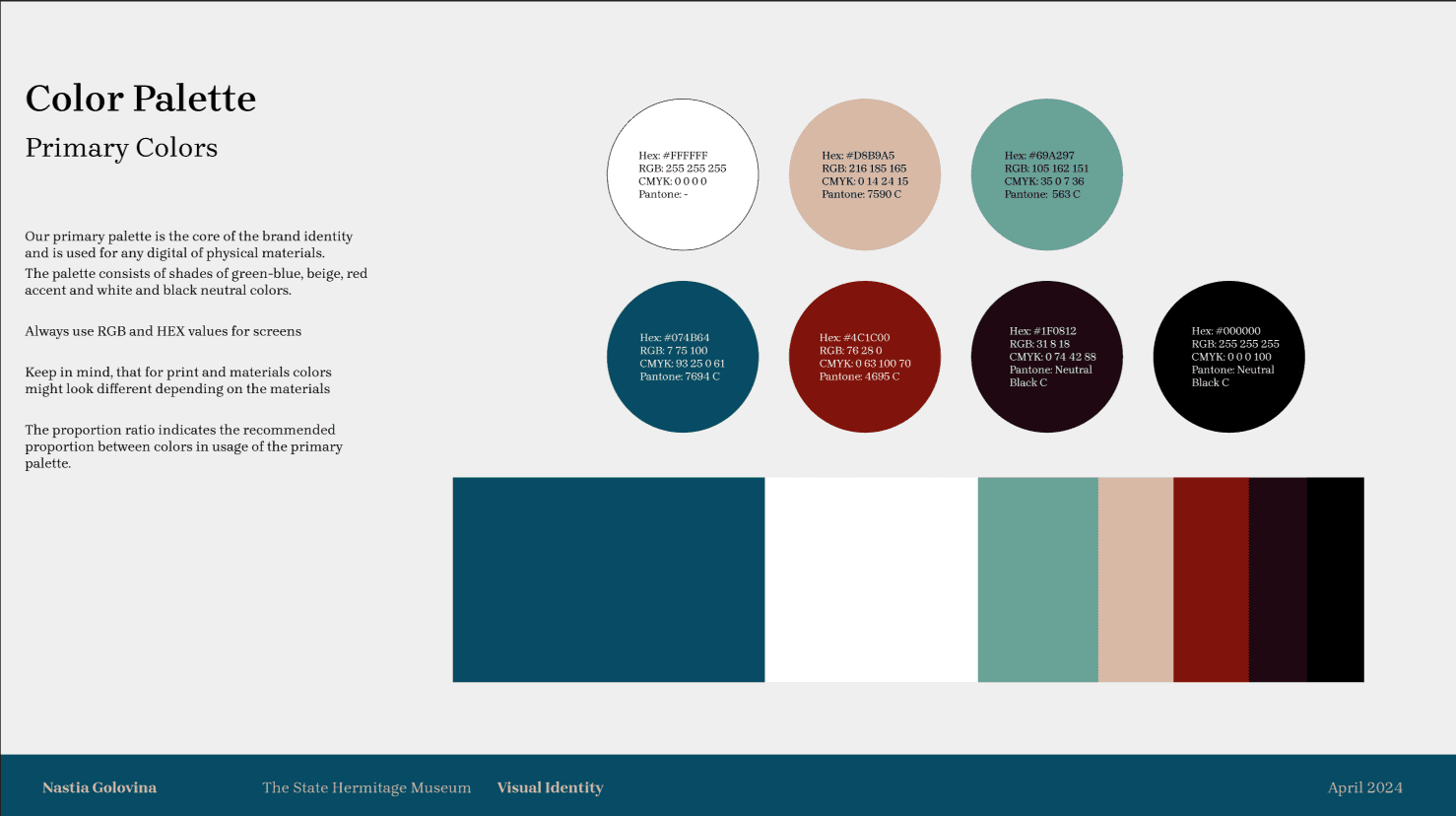
The use of the brand's colors in the presentation also reinforces the thematic style and creates a sense of consistency. The primary colors were applied consistently throughout the presentation, serving as accent colors without dominating the space.
LAYOUT
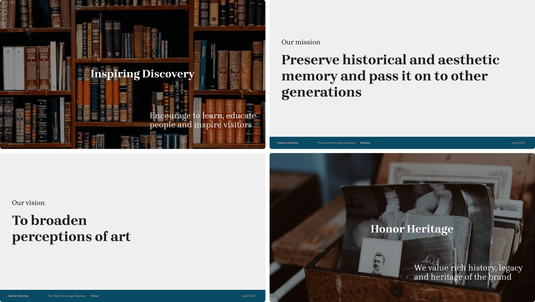
To maintain the readability of the slides, a minimalist style with ample white space was chosen. This approach emphasizes key information, highlights images and phrases, and brings focus to the core message
PRESENTATION
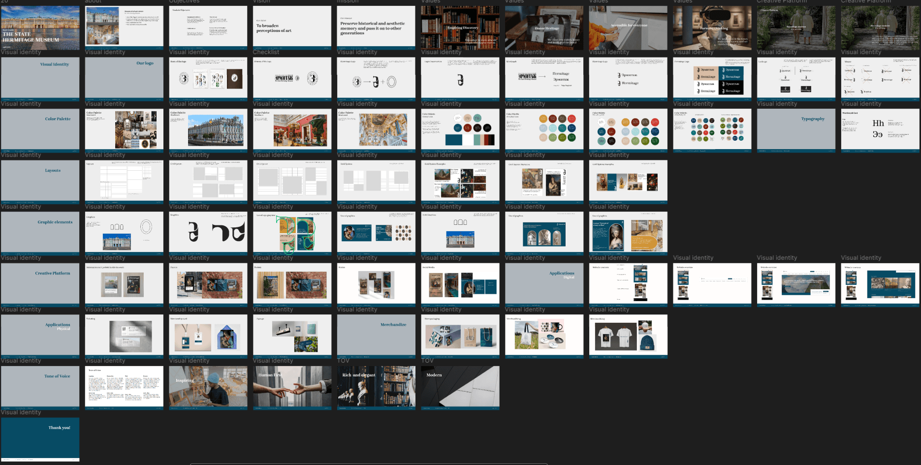
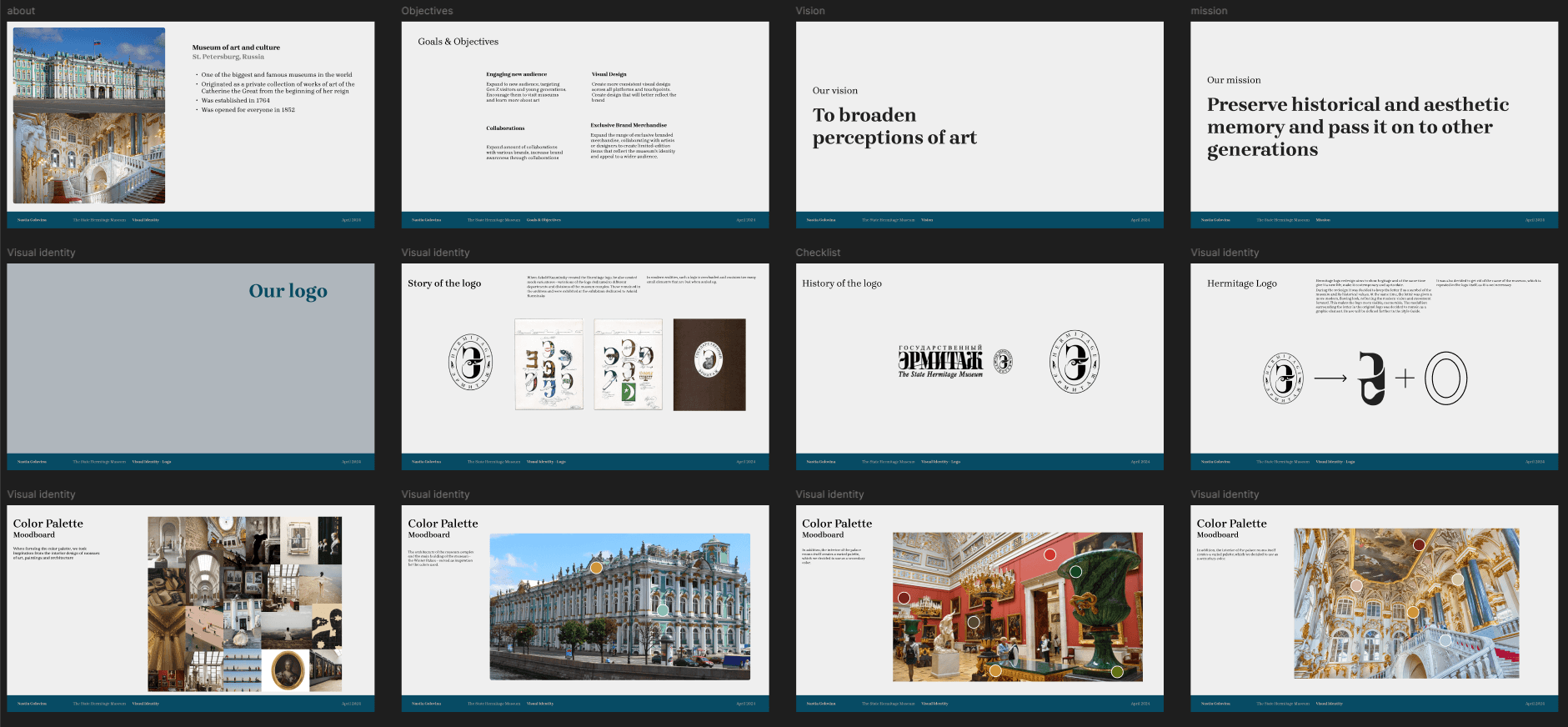
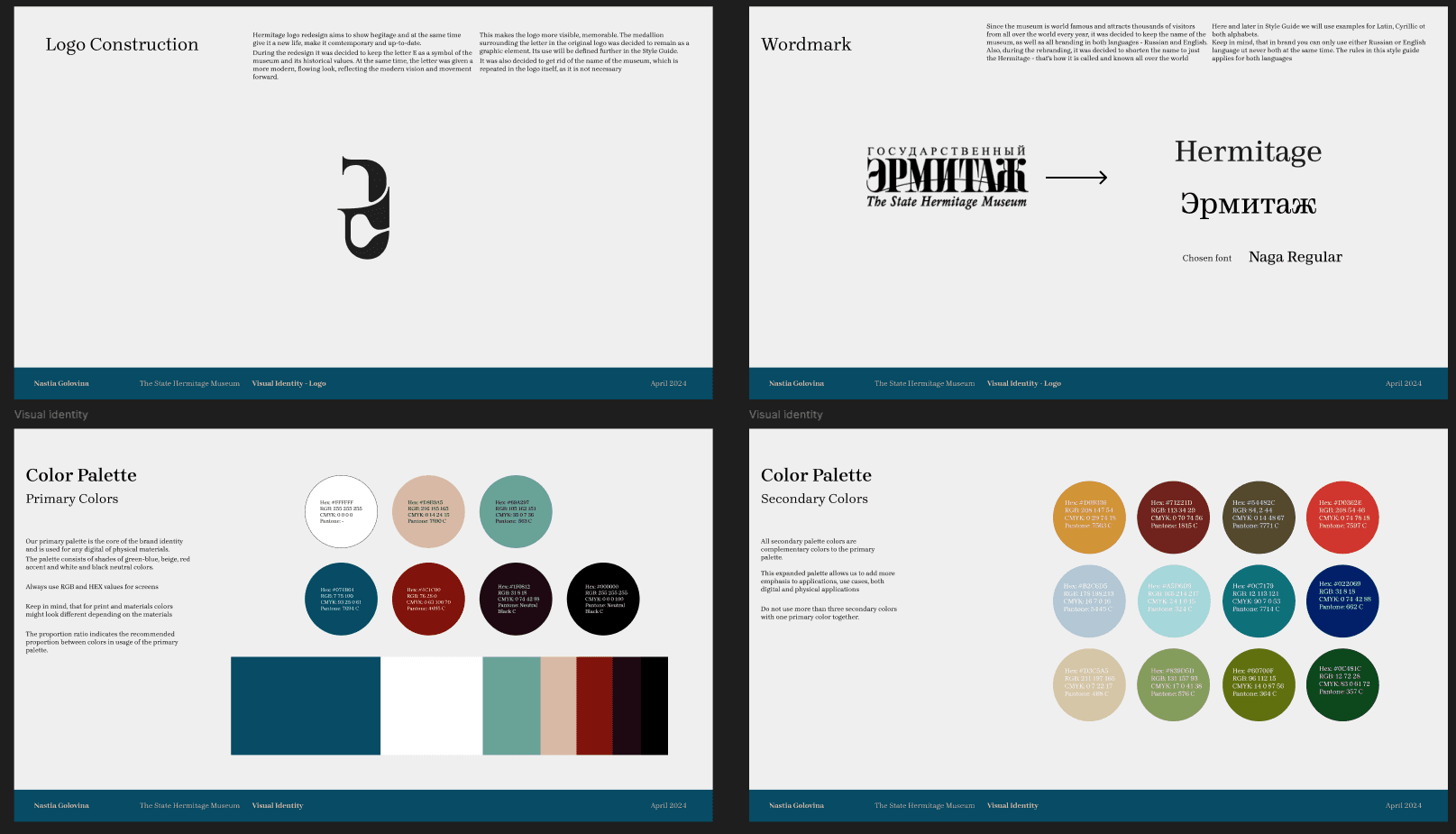
Presentation consist of around 50 slides, you can download full presentation here in PDF